Today’s goals is to compare readability with long versus wide format of data. Plus, we will fill a date column with missing values in a panel dataset. Let’s load the packages we are going to use:
library(tidyverse)

# set a theme to stay for the rest of the plotting
theme_set(theme_minimal())
Load the Data
We will be using COVID-19 vaccination data, which are available at the following repo. I also collected and wrangled the data here for Orizzonti Politici.
We proceed by loading the dataset via its url, so that it’s updated every time we run the script.
url_doses_delivered_ita <-
  "https://raw.githubusercontent.com/italia/covid19-opendata-vaccini/master/dati/consegne-vaccini-latest.csv"

read_csv(url_doses_delivered_ita, col_types = cols(area = col_factor())) %>%
  rename(
    dosi_consegnate = numero_dosi,
  ) %>%
  relocate(data_consegna, .after = 'area') -> doses

doses %>% head(10)
## # A tibble: 10 x 8
## area data_consegna fornitore dosi_consegnate codice_NUTS1 codice_NUTS2
## <fct> <date> <chr> <dbl> <chr> <chr>
## 1 ABR 2020-12-27 Pfizer/B… 135 ITF ITF1
## 2 ABR 2020-12-30 Pfizer/B… 7800 ITF ITF1
## 3 ABR 2021-01-05 Pfizer/B… 3900 ITF ITF1
## 4 ABR 2021-01-07 Pfizer/B… 3900 ITF ITF1
## 5 ABR 2021-01-11 Pfizer/B… 3900 ITF ITF1
## 6 ABR 2021-01-12 Pfizer/B… 4875 ITF ITF1
## 7 ABR 2021-01-13 Moderna 1300 ITF ITF1
## 8 ABR 2021-01-18 Pfizer/B… 3510 ITF ITF1
## 9 ABR 2021-01-20 Pfizer/B… 3510 ITF ITF1
## 10 ABR 2021-01-21 Pfizer/B… 2340 ITF ITF1
## # … with 2 more variables: codice_regione_ISTAT <dbl>, nome_area <chr>Our data has the following columns: area indicates the region, data when deliveries happened, fornitore is the supplier, dosi_consegnate how many doses have been delivered.
Now we will perform the same operations on the dataset. Namely, we are going to:
- Create the implicit missing values;
- Create a cumulative sum of doses column for each supplier;
- Create a cumulative sum of doses;
- Choose the most informative format.
Deal with implicit missing values
The quickest way (I know of) is to create a grid with the missing values and then join it with the data.
doses %>%
  tidyr::expand(
    # only works if it's the first argument
    data_consegna = full_seq(data_consegna, 1),
    area, fornitore) -> doses_grid
And then perform the join. In this case, we do not have to specify the argument on and the same dimensions of the joint item and the joined one show the join was executed successfully! (What a tongue twist.)
doses %>%
  full_join(doses_grid) %>%
  # reorder rows
  arrange(area, data_consegna) %>%
  # fill NAs
  mutate(dosi_consegnate = coalesce(dosi_consegnate, 0)) %>%
  arrange(area, data_consegna, fornitore) -> doses_long
Let’s use what we have done so far to make a visualisation:
doses_long %>%
  ggplot(aes(data_consegna, dosi_consegnate)) +
  geom_col(aes(fill = fornitore)) +
  labs(
    title = 'Total Vaccine Doses Delivered',
    x = NULL,
    y = NULL
  )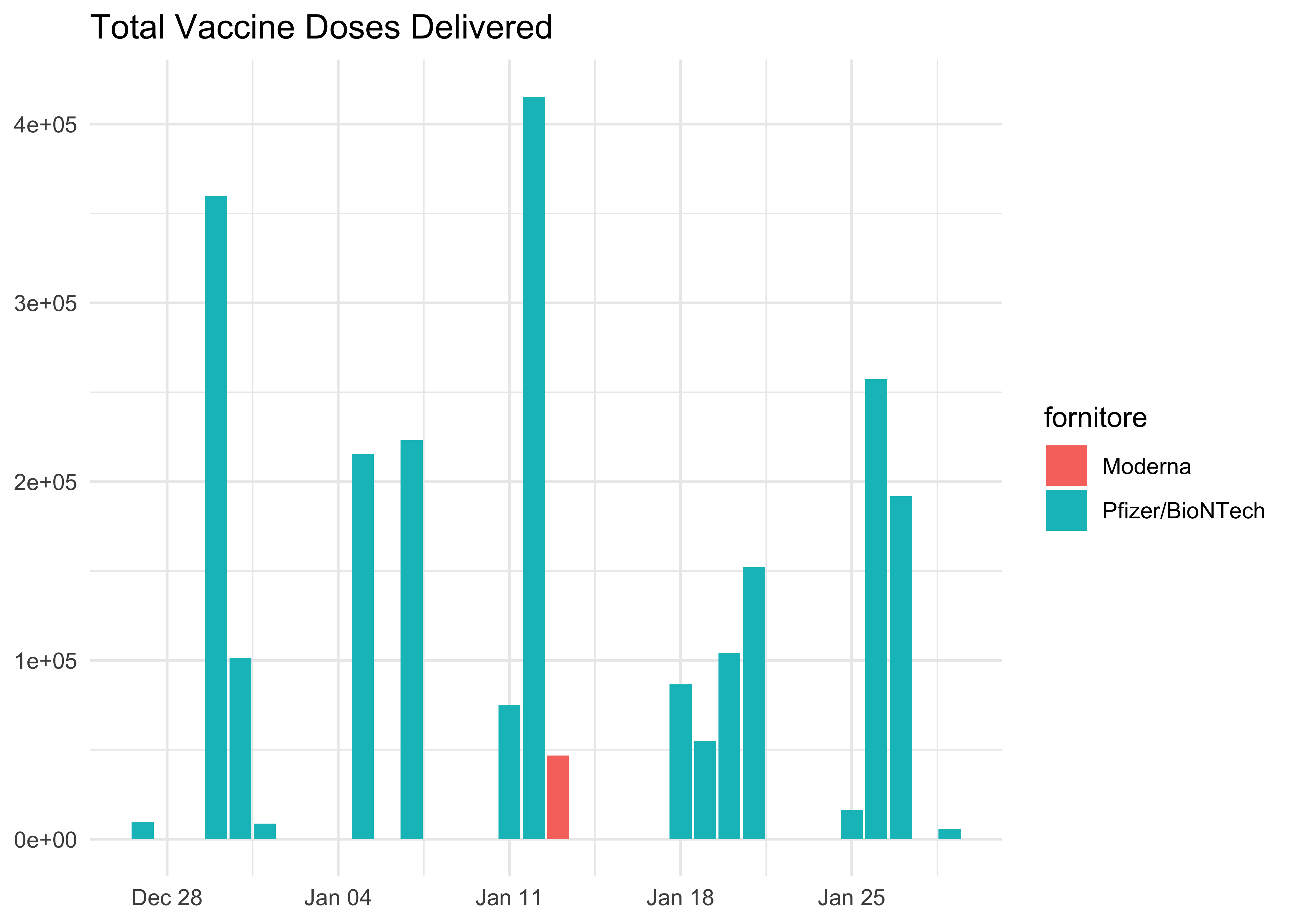
Moderna has so far made only one delivery!
Work with Long Format
Data is already in the long format (normally, we would need to use pivot_longer() to switch from wide to long format).
We might create a column with the cumulative total number of doses available each day in each region and set up a shiny app to monitor closely how things are going in each region.
Wide Format
Now, we have to turn doses into the wide format. First, we need to pivot the data: that’s almost half of the following code and it’s much easier than expected. Then we group the data by area and create a bunch of columns.
doses_long %>%
  # pivot to the wider format
  pivot_wider(
    # create new features out of the levels of the following column
    names_from = fornitore,
    # values of the new features come from the following column
    values_from = dosi_consegnate
  ) %>%
  # for simplicity, let's rename
  rename(
    dosi_pfizer = 'Pfizer/BioNTech',
    dosi_moderna = 'Moderna'
  ) %>%
  group_by(area) %>%
  mutate(
    # replce NA with zero
    dosi_pfizer = coalesce(dosi_pfizer, 0),
    dosi_moderna = coalesce(dosi_moderna, 0),
    # create columns with totals
    totale_pfizer = cumsum(dosi_pfizer),
    totale_moderna = cumsum(dosi_moderna),
    totale_dosi = totale_moderna + totale_pfizer
  ) %>%
  ungroup() -> doses_wide

doses_wide %>% head(10)
## # A tibble: 10 x 11
## area data_consegna codice_NUTS1 codice_NUTS2 codice_regione_… nome_area
## <fct> <date> <chr> <chr> <dbl> <chr>
## 1 ABR 2020-12-27 <NA> <NA> NA <NA>
## 2 ABR 2020-12-27 ITF ITF1 13 Abruzzo
## 3 ABR 2020-12-28 <NA> <NA> NA <NA>
## 4 ABR 2020-12-29 <NA> <NA> NA <NA>
## 5 ABR 2020-12-30 <NA> <NA> NA <NA>
## 6 ABR 2020-12-30 ITF ITF1 13 Abruzzo
## 7 ABR 2020-12-31 <NA> <NA> NA <NA>
## 8 ABR 2021-01-01 <NA> <NA> NA <NA>
## 9 ABR 2021-01-02 <NA> <NA> NA <NA>
## 10 ABR 2021-01-03 <NA> <NA> NA <NA>
## # … with 5 more variables: dosi_moderna <dbl>, dosi_pfizer <dbl>,
## # totale_pfizer <dbl>, totale_moderna <dbl>, totale_dosi <dbl>Long vs Wide Format
Each of the two has its own shortcomings and advantages. Let’s see some visual examples:
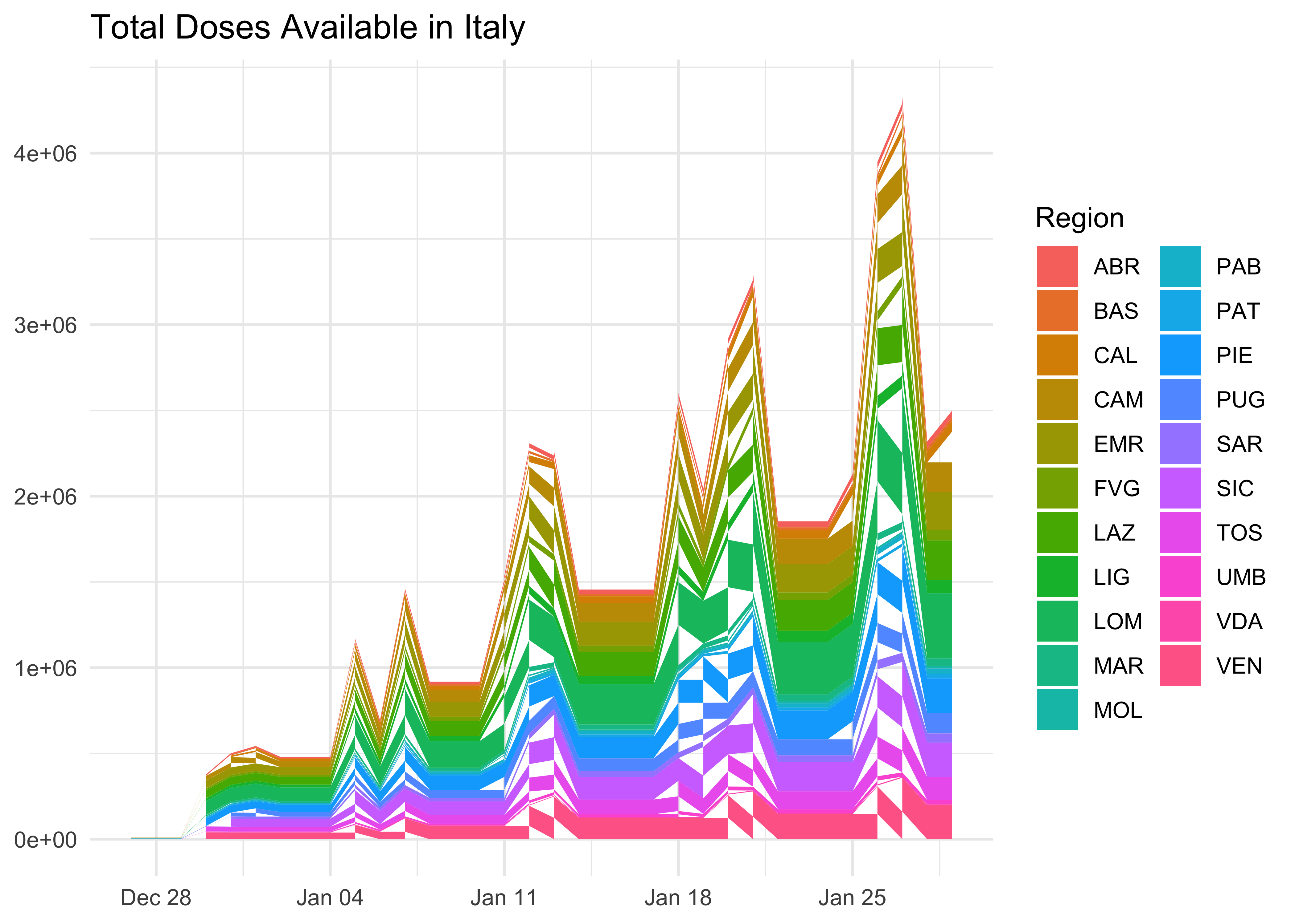
Cumulative Doses Available
doses_wide %>%
  ggplot(aes(
    x = data_consegna,
    y = totale_dosi,
    fill = area)) +
  geom_area() +
  labs(
    title = 'Total Doses Available in Italy',
    x = NULL,
    y = NULL,
    fill = 'Region'
) 
This can’t be swiftly achieved with a long format:
doses_long %>%
  group_by(area, fornitore) %>%
  mutate(totale_dosi = cumsum(dosi_consegnate)) %>%
  ggplot(aes(data_consegna, totale_dosi, fill = area)) +
  geom_area()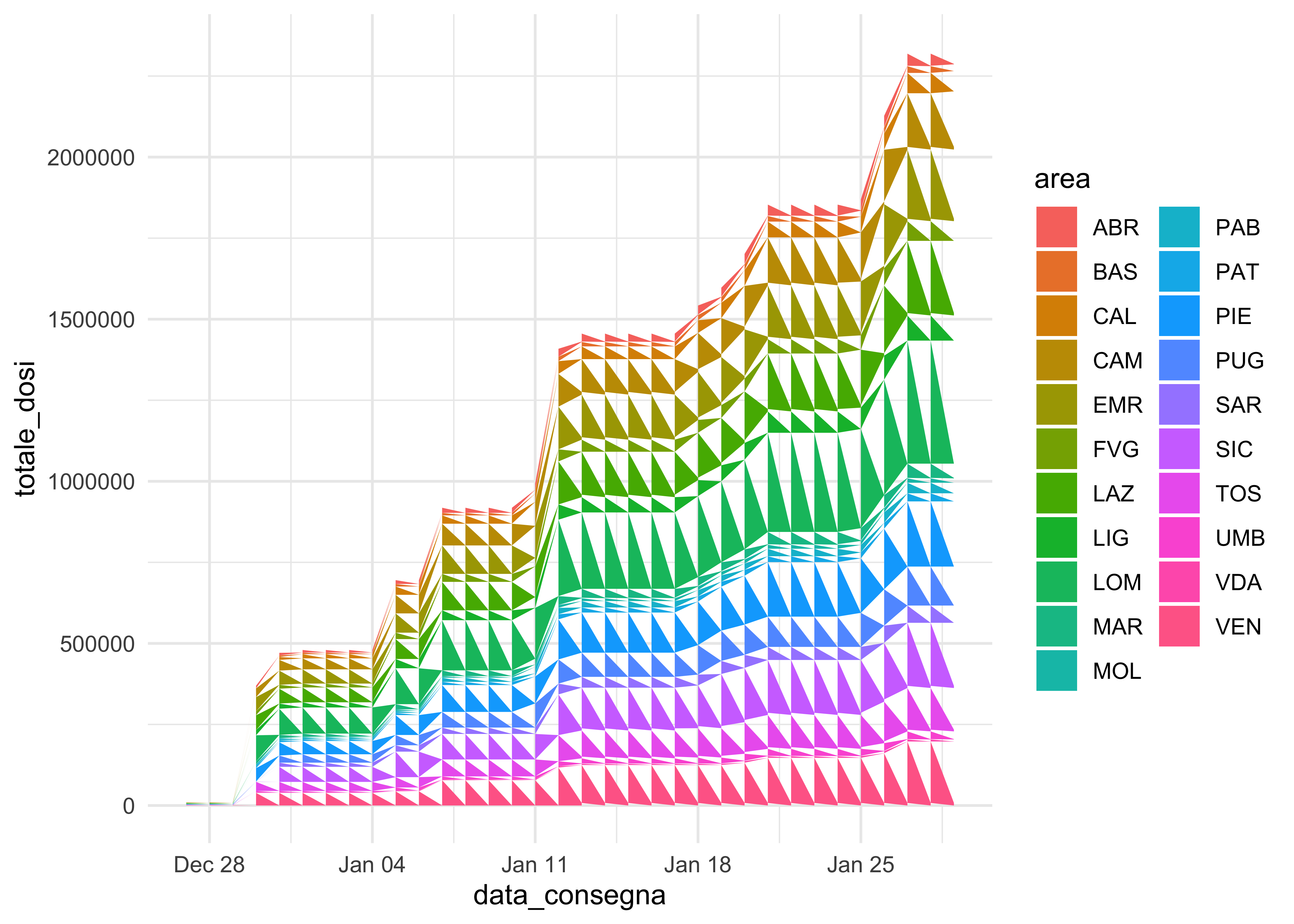
doses_long %>%
  group_by(area, fornitore) %>%
  mutate(totale_dosi = cumsum(dosi_consegnate)) %>%
  ggplot(aes(data_consegna, totale_dosi, fill = area)) +
  geom_col()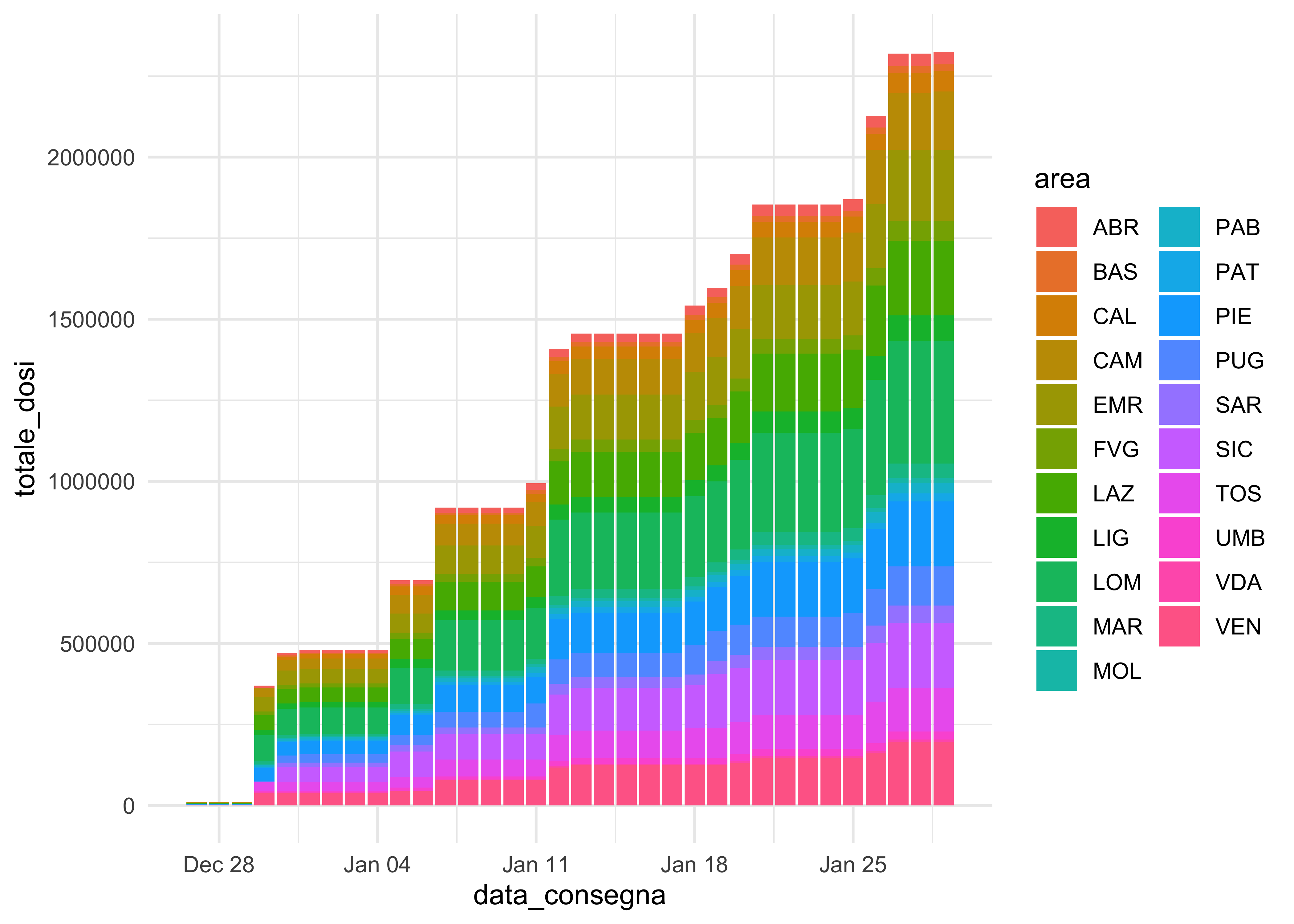
doses_long %>%
  group_by(area, fornitore) %>%
  mutate(totale_dosi = cumsum(dosi_consegnate)) %>%
  ggplot(aes(data_consegna, totale_dosi, fill = fornitore)) +
  geom_col()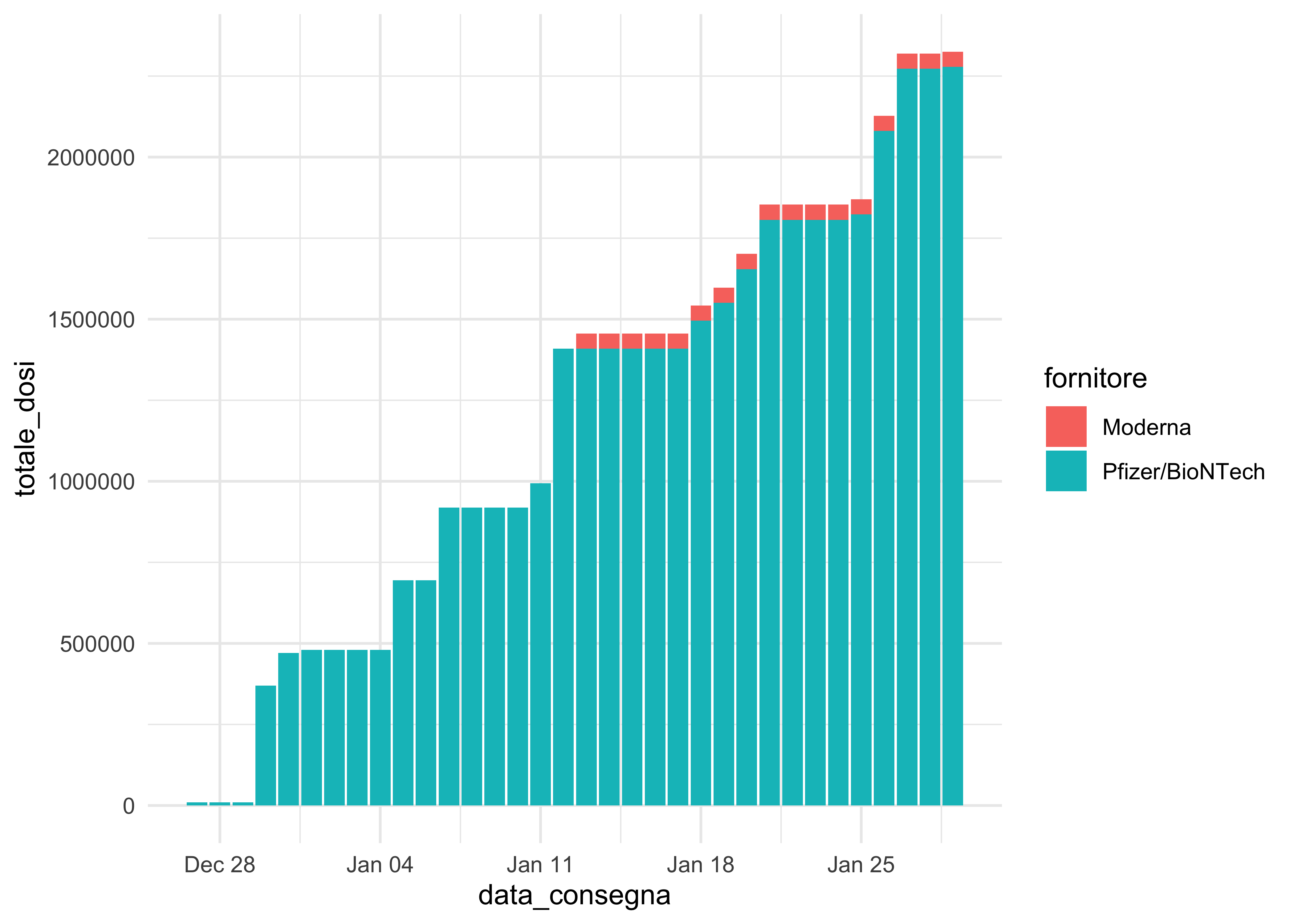
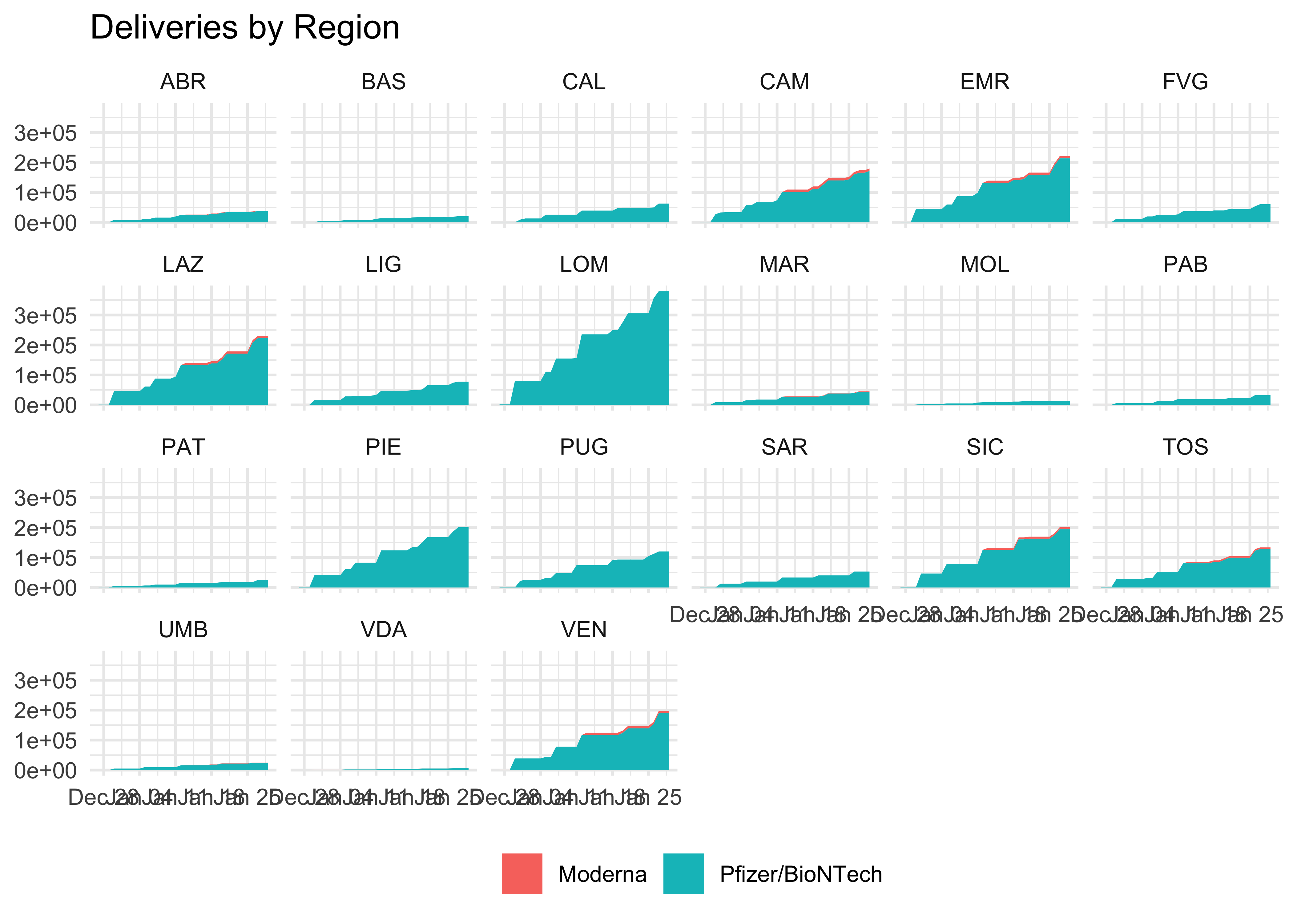
geom_area() fails and geom_col() is not as elegant. We can use it for faceting, though!
doses_long %>%
  group_by(area, fornitore) %>%
  mutate(totale_dosi = cumsum(dosi_consegnate)) %>%
  ggplot(aes(data_consegna, totale_dosi, fill = fornitore)) +
  geom_area() +
  facet_wrap(~ area, nrow = 4) +
  theme(legend.position = 'bottom') +
  labs(
    title = 'Deliveries by Region',
    x = NULL,
    y = NULL,
    fill = NULL
  )
Vaccine Deliveries Grouped by Area
Let’s use group_by(area) to get cumulative data for each region.
doses_wide %>%
  group_by(area) %>%
  summarise(
    totale_pfizer = sum(dosi_pfizer),
    totale_moderna = sum(dosi_moderna)
  ) %>%
  mutate(
    totale_dosi = totale_pfizer + totale_moderna
  ) %>%
  add_row(
    area = 'ITA',
    totale_pfizer = sum(.$totale_pfizer),
    totale_moderna = sum(.$totale_moderna),
    totale_dosi = sum(.$totale_dosi),
  )
## # A tibble: 22 x 4
## area totale_pfizer totale_moderna totale_dosi
## <chr> <dbl> <dbl> <dbl>
## 1 ABR 37380 1300 38680
## 2 BAS 20775 0 20775
## 3 CAL 62680 0 62680
## 4 CAM 171345 8200 179545
## 5 EMR 213525 7400 220925
## 6 FVG 60715 0 60715
## 7 LAZ 222670 7500 230170
## 8 LIG 77540 0 77540
## 9 LOM 379530 0 379530
## 10 MAR 43880 1500 45380
## # … with 12 more rowsThe wide format does not offer much, but can be better integrated with other data to create new features. The long format allows to make quick plotting, but adding a row with totals for the country would be definitely more demaning.
doses_long %>%
  group_by(area, fornitore) %>%
  summarise(
    totale_dosi = sum(dosi_consegnate)
  ) %>%
  ggplot(aes(area, totale_dosi, fill = fornitore)) +
  geom_col() +
  theme(legend.position = 'bottom')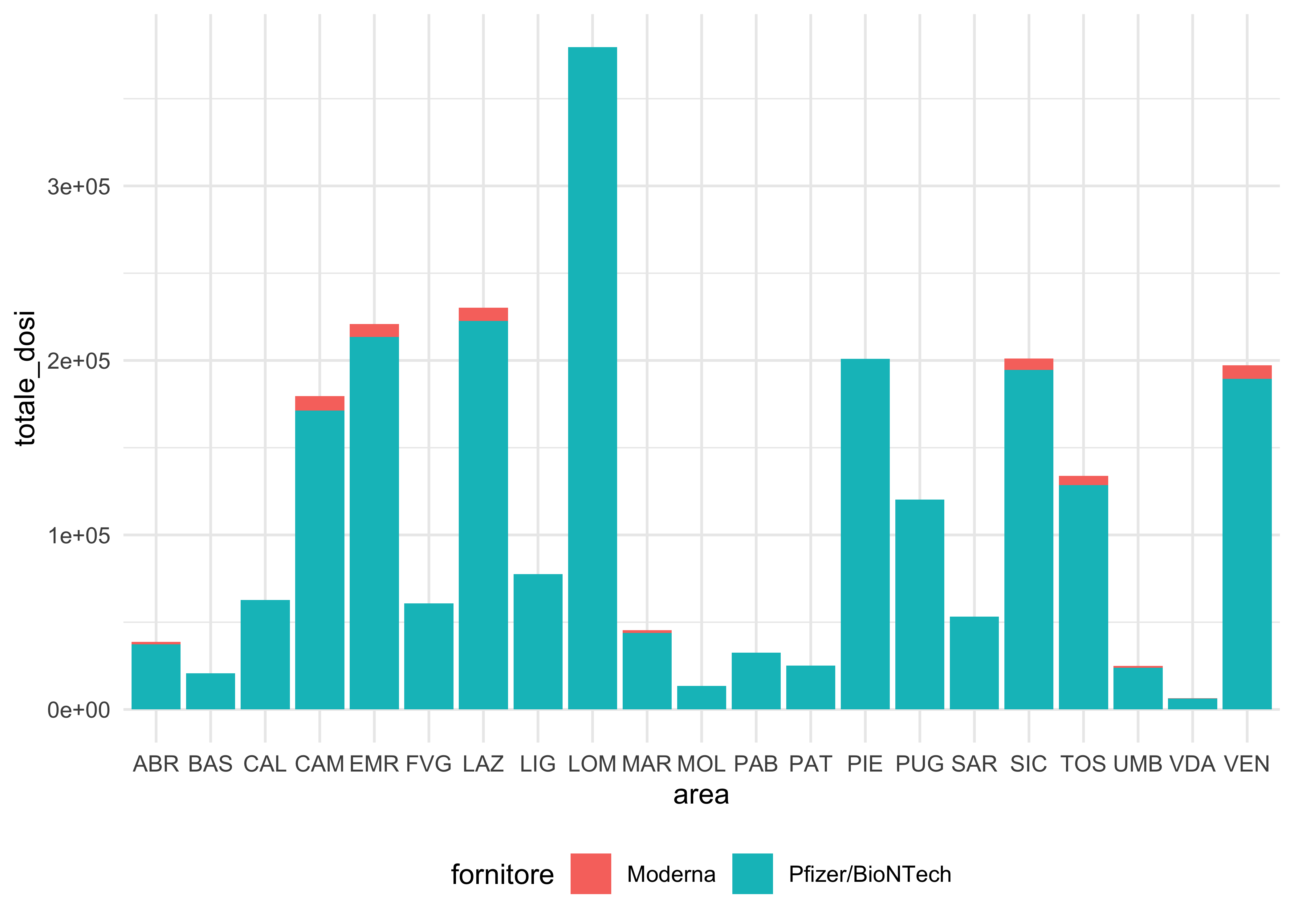
Vaccine Deliveries Grouped by Date
We will group_by(data) to obtain how many doses have been delivered in the whole of Italy every day by each supplier:
doses_wide %>%
  group_by(data_consegna) %>%
  summarise(
    totale_pfizer = sum(dosi_pfizer),
    totale_moderna = sum(dosi_moderna),
  ) %>%
  mutate(
    totale_dosi_consegnate = totale_pfizer + totale_moderna,
    totale_dosi = cumsum(totale_dosi_consegnate)
  ) %>%
  ggplot(aes(data_consegna, totale_dosi)) +
  geom_area(fill = 'cadetblue')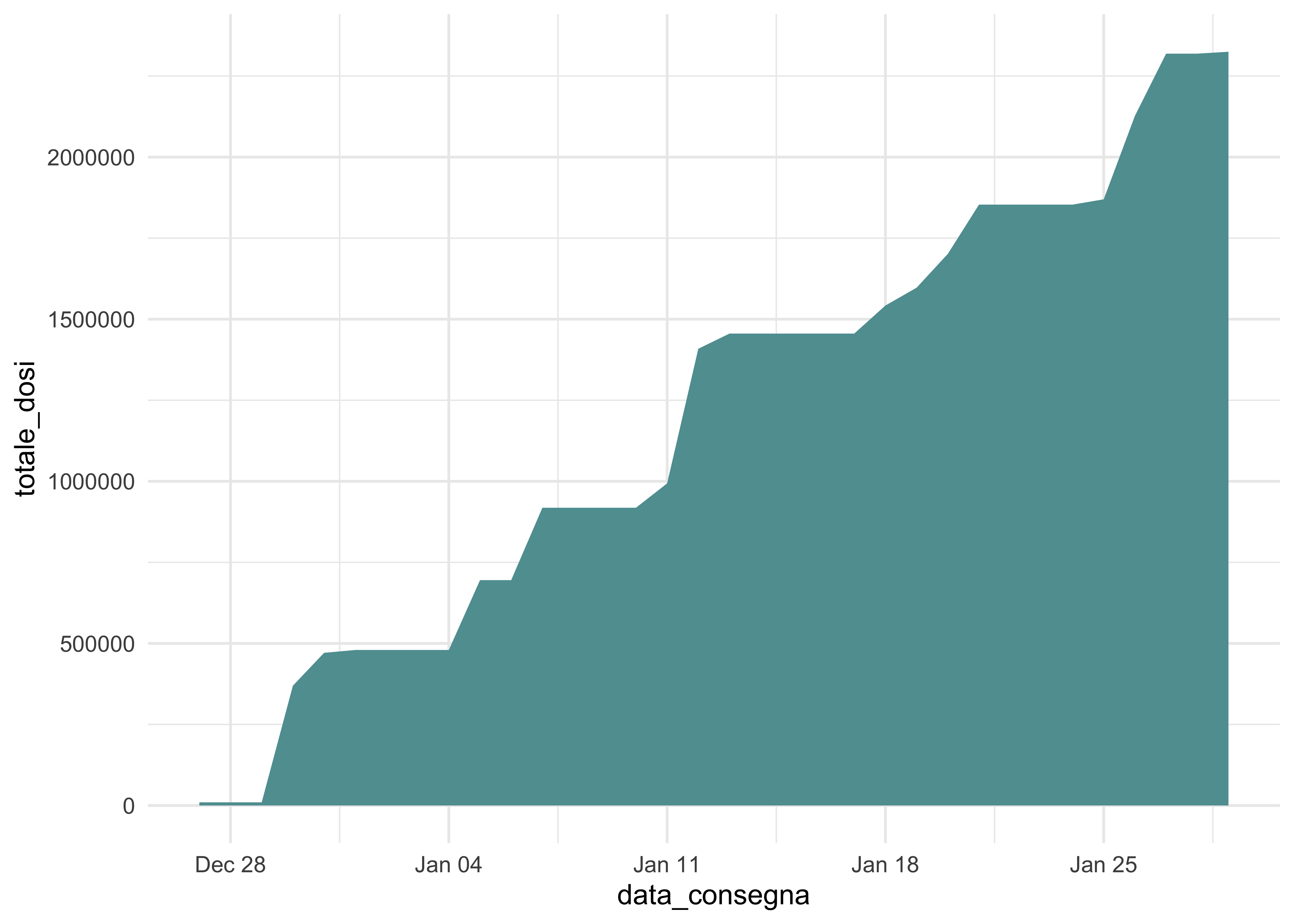
This does not really tell much more. But, once again, it can be enriched with other data and have multiple objects (rather than layers/dimensions).