Now that we have wrangled the data a bit, we can proceed with some visualisations. We want to plot three things:
- How many vaccinations are administered daily.
- How many doses have been administered so far and their ratio.
- See how regions perform in terms of doses administered and doses received.
Data Wrangling
Let’s load the data:
read_csv(
  'https://raw.githubusercontent.com/orizzontipolitici/covid19-vaccine-data/main/data_ita/doses_by_date_ita.csv',
) -> doses_by_date

read_csv(
  'https://raw.githubusercontent.com/orizzontipolitici/covid19-vaccine-data/main/data_ita/vaccinations_by_area_ita.csv', col_types = cols(area = col_factor()) ) -> vaccinations_by_area
These two datasets are incompatible: first, data grouped by area needs to be grouped to the Italian level. Then, we need to transform deliveries data into the long format.
Let’s start with grouping vaccination data. Columns beyond the twelfth are not needed: basically, they are the sum of the doses injected each day… which is exactly what we will be computing within summarise()!
vaccinations_by_area %>%
  # the other columns are the same as the summarised one
  select(1:12) %>%
  group_by(data, fornitore) %>%
  summarise(across(where(is.numeric), sum)) %>%
  ungroup() -> vaccinations_by_date
Then, let’s move to vaccine data. This seems a bit more challenging at first, as we need to pack the two columns with the total deliveries of each supplier into a single one. pivot_longer() comes to rescue!
doses_by_date %>%
  # we will just need data and the two supplier cols
  select(-totale_dosi_consegnate, -totale_dosi) %>%
  # to get prettier names into the new column
  rename(
    'Pfizer/BioNTech' = totale_pfizer,
    Moderna = totale_moderna
  ) %>%
  # pivot longer magic:
  pivot_longer(c('Pfizer/BioNTech', Moderna),
               # will have values Pfizer/BioNTech and Moderna
               names_to = 'fornitore',
               # will report the deliveries of the day
               values_to = 'consegne') %>%
  # we need to add cumulative doses available at each date
  group_by(fornitore) %>%
  mutate(dosi_totali = cumsum(consegne)) -> doses_by_date_long
Vaccinations: First and Second Doses
Now that the two are compatible, we could join them. However, given the structure of the data, we’d better create two new separate tables: for instance, since we cannot observe to who the first and second shots are administered, we can create a new table with this info only.
vaccinations_by_date %>%
  select(data, fornitore, prima_dose, seconda_dose) %>%
  pivot_longer(cols = !c(data, fornitore),
               names_to = 'dose',
               values_to = 'count') %>%
  group_by(fornitore, dose) %>%
  mutate(
    total_count = cumsum(count)
  ) -> vaccinations_long
Vaccines from Moderna are so few right now that we might as well group by it. In the future, comparing how shots are administered by each supplier would bear greater value.
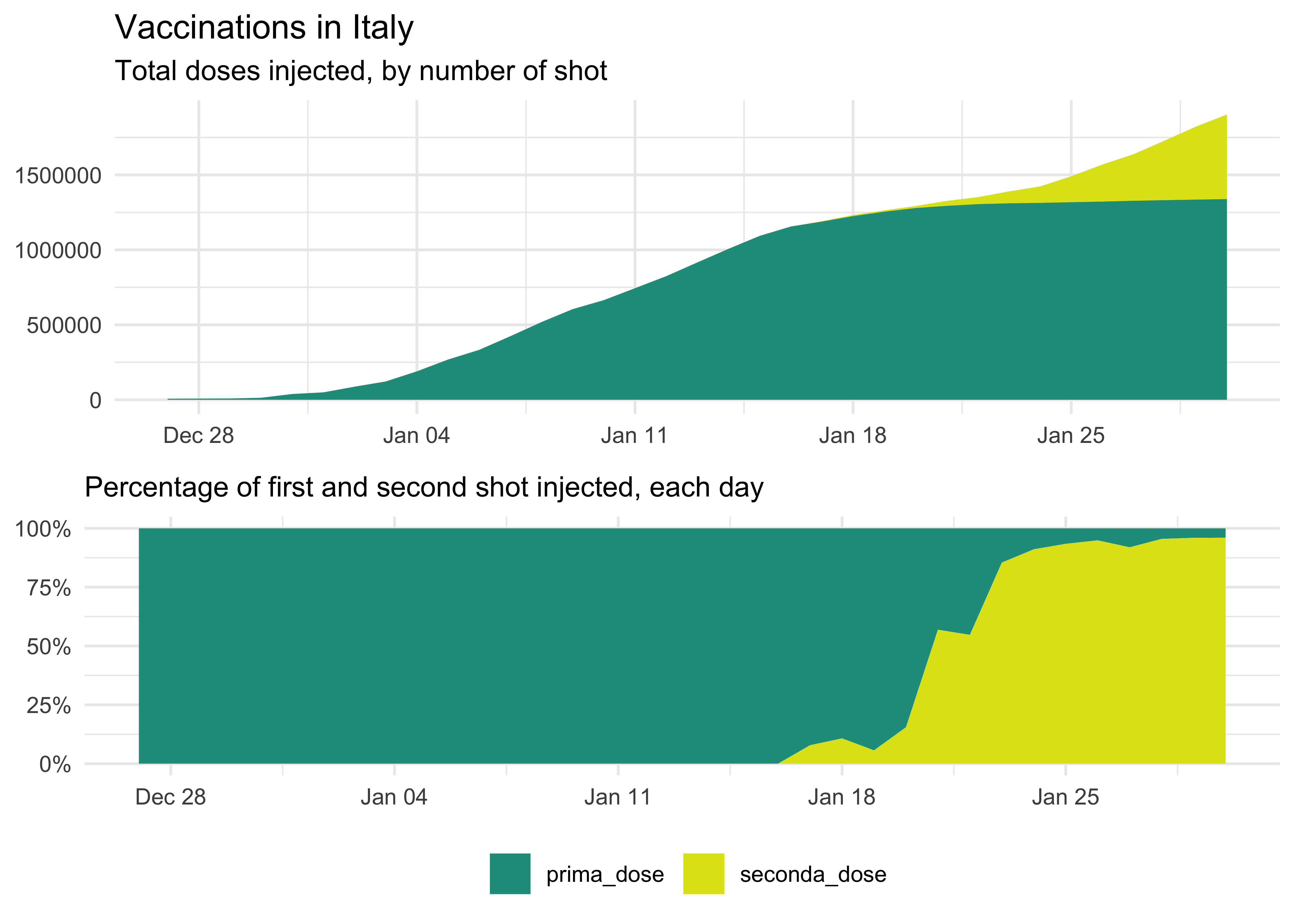
vaccinations_long %>%
group_by(data, dose) %>%
summarise(across(where(is.numeric), sum)) %>%
# swap the order of the factor
mutate(dose = fct_rev(dose)) %>%
ggplot(aes(data, total_count, fill = dose)) +
geom_area() +
scale_fill_viridis_d(begin = 0.95, end = 0.55) +
labs(
title = 'Vaccinations in Italy',
subtitle = 'Cumulative First and Second Doses Administered',
x = NULL,
y = NULL,
fill = NULL
) +
theme(legend.position = 'bottom')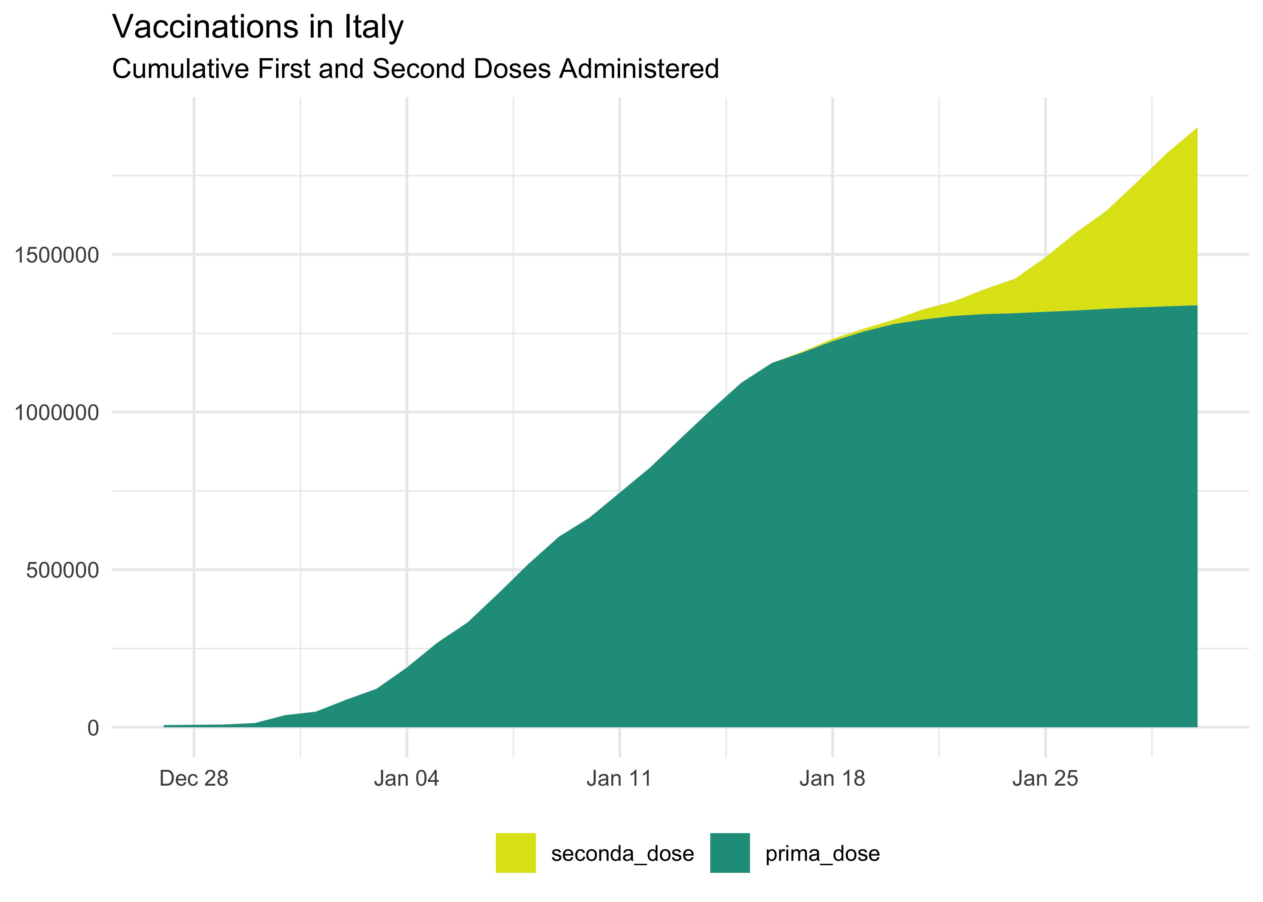 We can also show it as a percentage: it’s a bit more complicated since we have to move from wider to create the new percentage columns and then back to longer for plotting.
vaccinations_long %>%
  group_by(data, dose) %>%
  summarise(across(where(is.numeric), sum)) %>%
  # pivot back to wider to create new columns
  pivot_wider(
    !total_count,
    names_from = dose,
    values_from = c(count)
  ) %>%
  # take out redundant text from column names
  rename_with( ~ stringr::str_remove(.x, c('count_'))) %>%
  mutate(across(
    # apply it to these cols
    c(prima_dose, seconda_dose),
    # replace with
    ~ .x / (prima_dose + seconda_dose)
  )) %>%
  # pivot to longer
  pivot_longer(
    # don't use data
    !data,
    # names and values
    names_to = 'dose',
    values_to = 'pct'
  ) %>%
  ggplot(aes(data, pct, fill = dose)) +
  geom_area() +
  scale_fill_viridis_d(begin = 0.55, end = 0.95) +
  labs(
    title = 'Vaccinations in Italy',
    subtitle = 'Cumulative First and Second Doses Administered',
    x = NULL,
    y = NULL,
    fill = NULL
  ) +
  scale_y_continuous(labels = scales::percent) +
  theme(legend.position = 'bottom')
Daily Vaccinations Data
We can also plot a line with daily shots (again, data is grouped by fornitore):
vaccinations_long %>%
  group_by(data, dose) %>%
  summarise(across(where(is.numeric), sum)) %>%
  ungroup() %>%
  ggplot(aes(data, count, col = dose)) +
  geom_line() +
  # `begin` and `end` are swapped as factors are not swapped as in the graph above
  scale_color_viridis_d(begin = 0.55, end = 0.95) +
  labs(
    title = 'Vaccinations in Italy',
    subtitle = 'First and Second Doses Administered',
    x = NULL,
    y = NULL,
    color = NULL
  ) +
  theme(legend.position = 'bottom')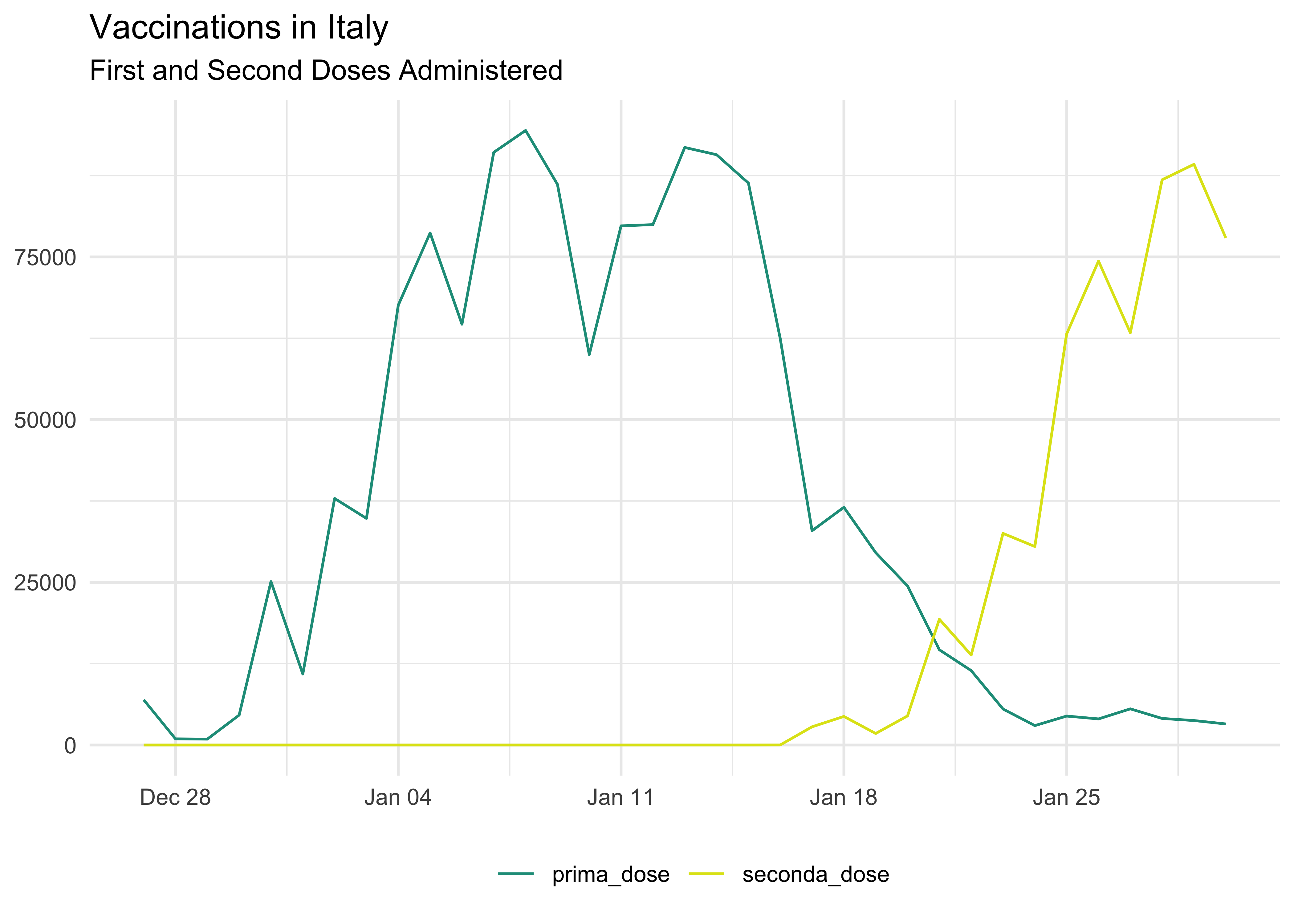
Putting these together
We will be using a call to ggpubr::ggarrange():
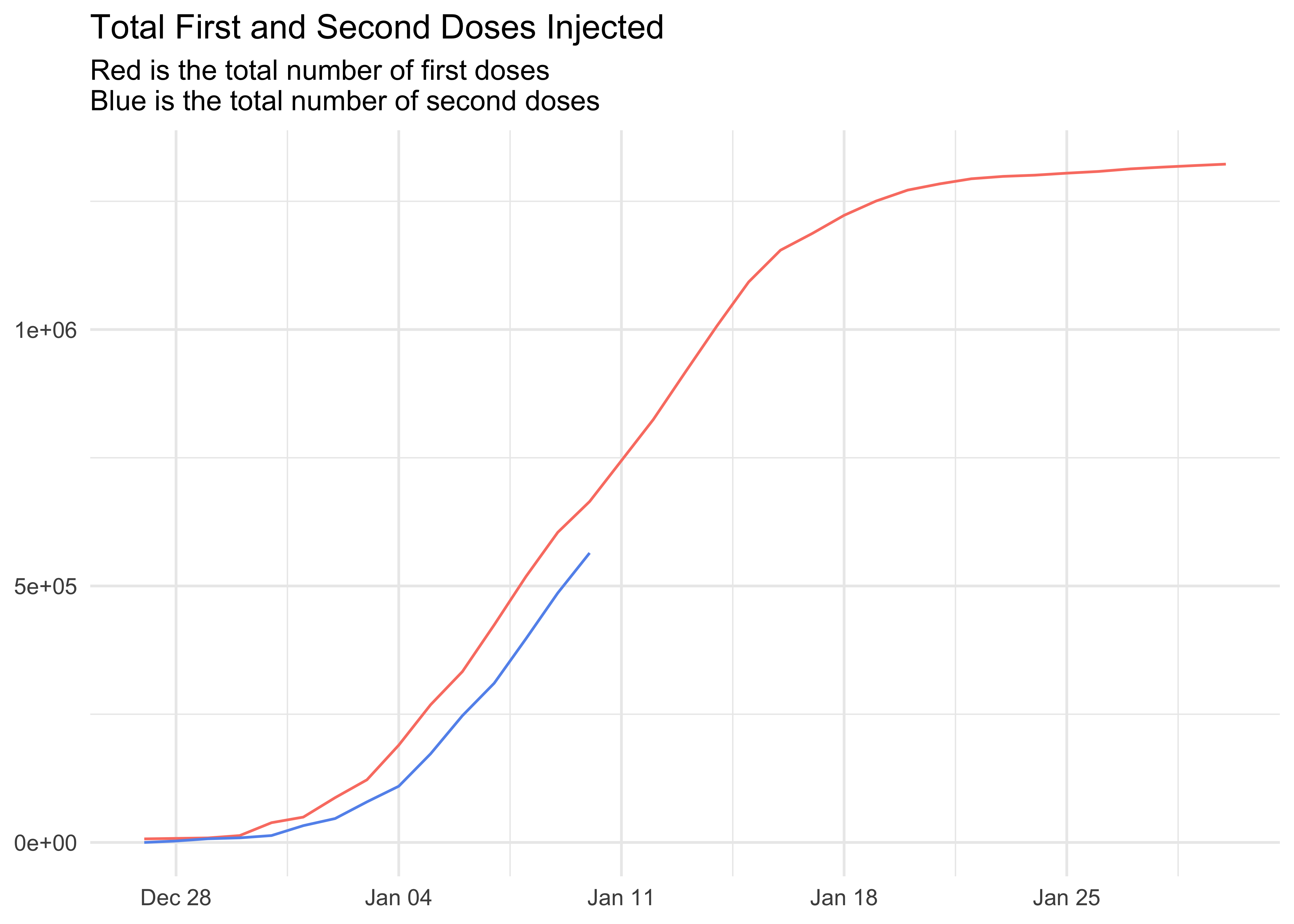
Comparing First and Second Doses
vaccinations_by_date %>%
  filter(fornitore != 'Moderna') %>%
  select(data, prima_dose, seconda_dose) %>%
  mutate(lead = lead(seconda_dose, 20)) %>%
  ggplot(aes(data, cumsum(prima_dose))) +
  geom_line(col = 'salmon') +
  geom_line(aes(y = cumsum(lead)), col = 'cornflowerblue') +
  labs(
    title = 'Total First and Second Doses Injected',
    subtitle = 'Red is the total number of first doses\nBlue is the total number of second doses',
    x = NULL,
    y = NULL
  )
To whom doses are administered to?
Let’s use vaccinations data to see how shots are distributed.
Male and Female
National Level
vaccinations_by_area %>%
  group_by(data) %>%
  summarise(across(where(is.numeric), sum)) %>%
  select(data, sesso_maschile, sesso_femminile) %>%
  pivot_longer(!data, names_to = 'sesso', values_to = 'count') %>%
  ggplot(aes(data, count, fill = sesso)) +
  geom_col() +
  labs(
    title = 'Vaccinations by Sex in Italy',
    subtitle = 'Blue is male, red is female',
    x = NULL,
    y = NULL,
    fill = NULL
  ) +
  theme(legend.position = 'none')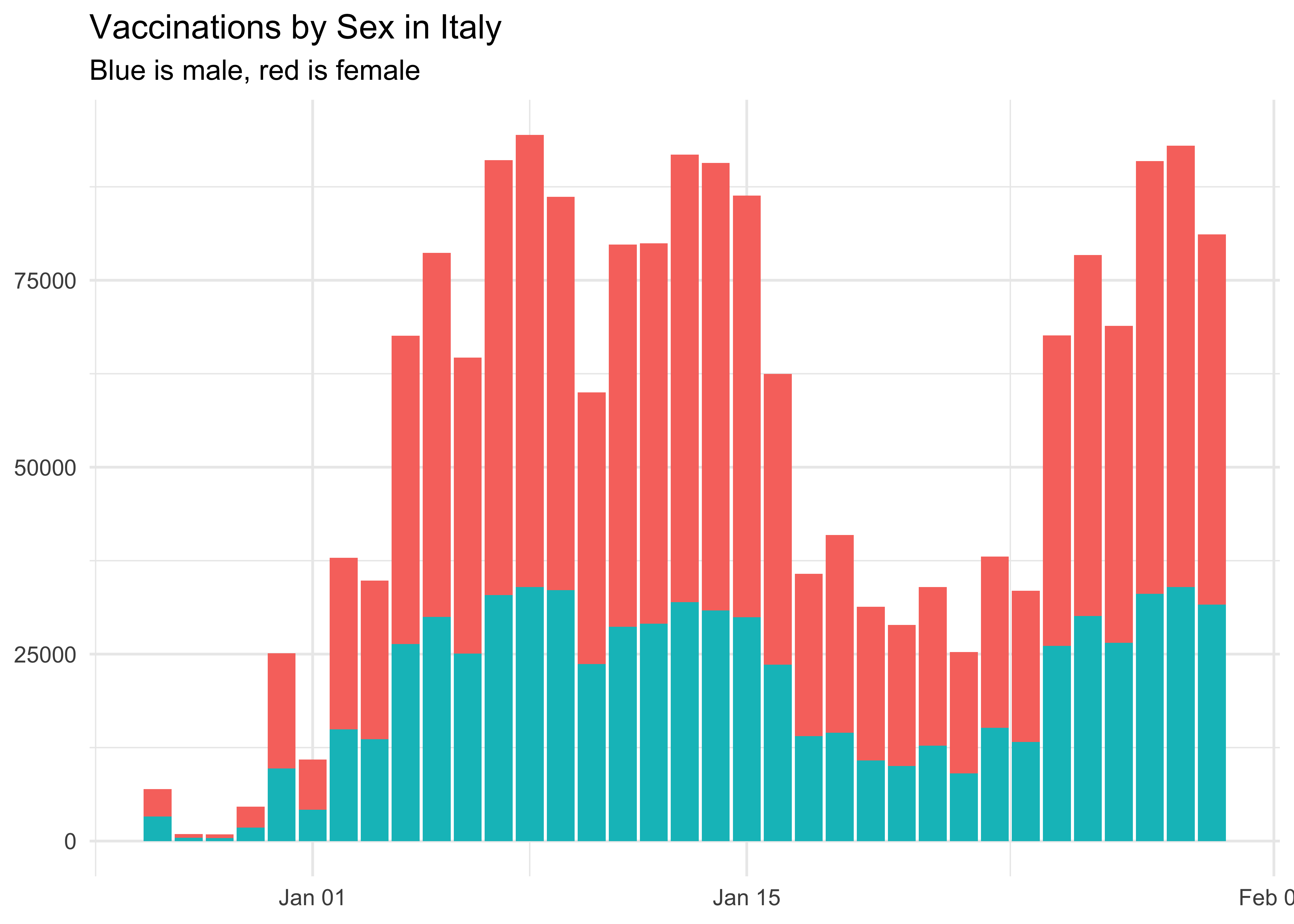
Let’s see it as percentage:
vaccinations_by_area %>%
  # we are not interested in the supplier
  group_by(data) %>%
  summarise(across(where(is.numeric), sum)) %>%
  select(data, sesso_maschile, sesso_femminile) %>%
  mutate(
    # transform into percentage
    across(c(sesso_femminile, sesso_maschile), ~ .x / (sesso_maschile + sesso_femminile)),
    # replace NAs with 0
    across(where(is.numeric), ~ coalesce(.x, 0L))
  ) %>%
  pivot_longer(!data, names_to = 'sesso', values_to = 'count') %>%
  ggplot(aes(data, count, fill = sesso)) +
  geom_col() +
  labs(
    title = 'Vaccinations by Sex, per Area',
    subtitle = 'Blue is male, red is female',
    x = NULL,
    y = NULL,
    fill = NULL
  ) +
  scale_y_continuous(labels = scales::percent) +
  theme(legend.position = 'none')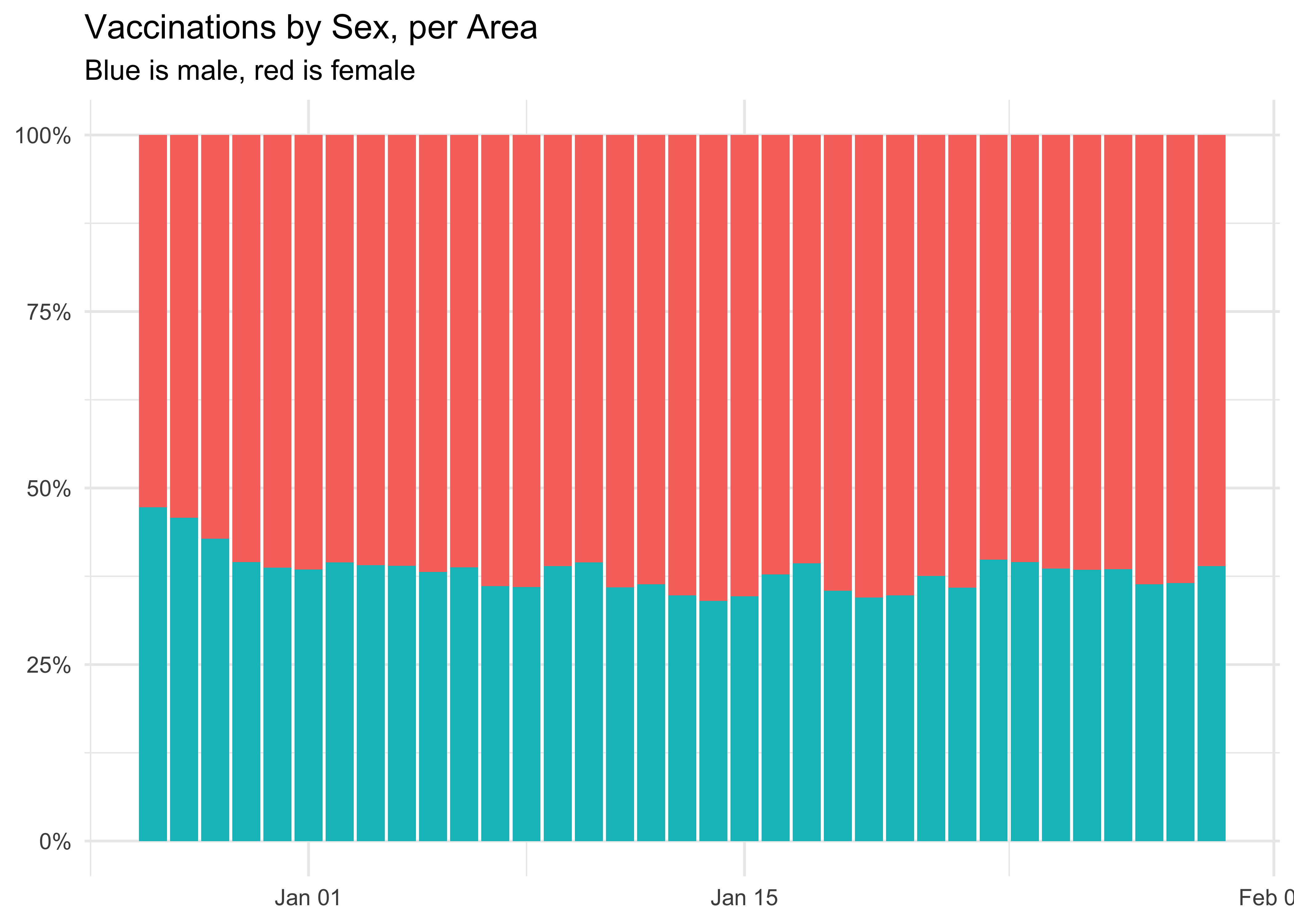
At the national level, more women are being vaccinated than men. This may also be due to more of them being health workers.
Regional Level with facet_grid()
We exploit the extra area information to see these proportions at the local level. Given the high number of regions, it’s won’t look pretty, at all! I shall get back to this with shiny, soon.
vaccinations_by_area %>%
  select(data, area, sesso_maschile, sesso_femminile) %>%
  pivot_longer(!c(data, area), names_to = 'sesso', values_to = 'count') %>%
  ggplot(aes(data, count, fill = sesso)) +
  geom_col() +
  facet_wrap(~ area, nrow = 3) +
  labs(
    title = 'Vaccinations by Sex, per Area',
    subtitle = 'Blue is male, red is female',
    x = NULL,
    y = NULL,
    fill = NULL
  ) +
  # to make the dates fit! thanks to `r-graphics.org`!
  theme(axis.text.x = element_text(angle = 30, hjust = 1)) +
  theme(legend.position = 'none')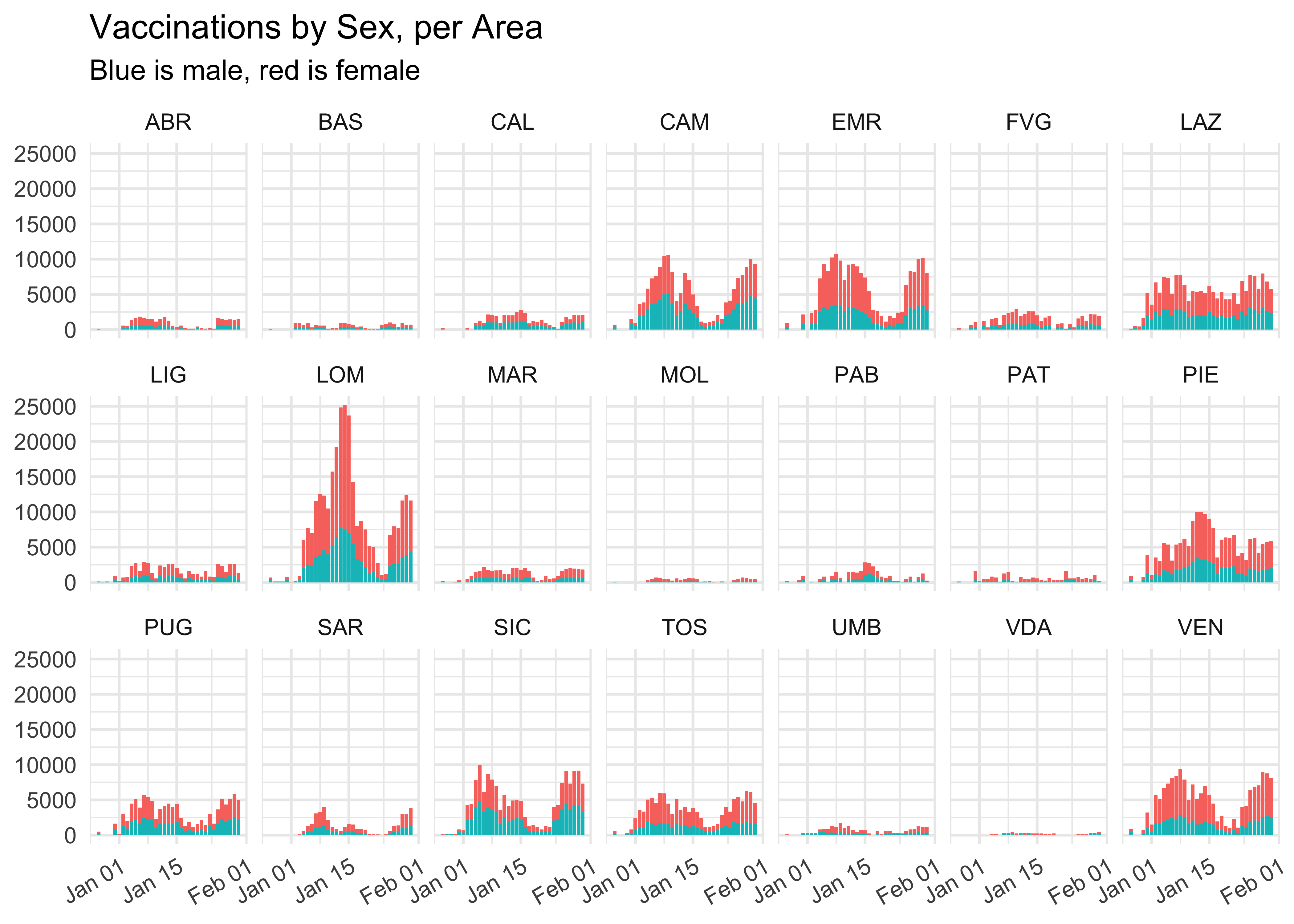
We did manage to avoid getting an absolute awful graph, though!
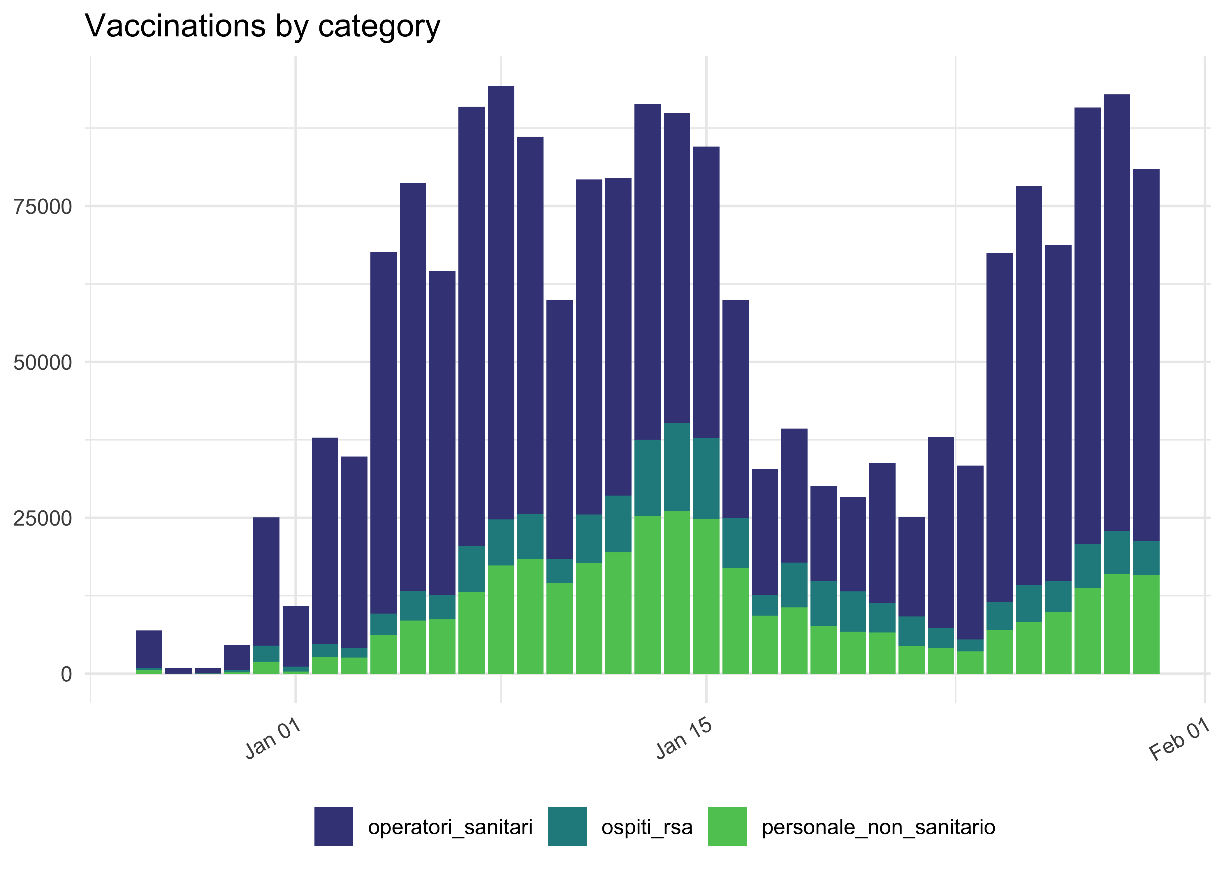
By Category
vaccinations_by_area %>%
  # show off some other selection syntax
  select(data, area, operatori_sanitari:ospiti_rsa) %>%
  # for now, no area
  group_by(data) %>%
  summarise(across(where(is.numeric), sum)) %>%
  pivot_longer(
    !data,
    names_to = 'categoria',
    values_to = 'count'
  ) %>%
  ggplot(aes(data, count, fill = categoria)) +
  geom_col() +
  theme(legend.position = 'bottom') +
  scale_fill_viridis_d(begin = 0.2, end = 0.75) +
  theme(axis.text.x = element_text(angle = 30, hjust = 1)) +
  labs(
    title = 'Vaccinations by category',
    x = NULL,
    y = NULL,
    fill = NULL
  )
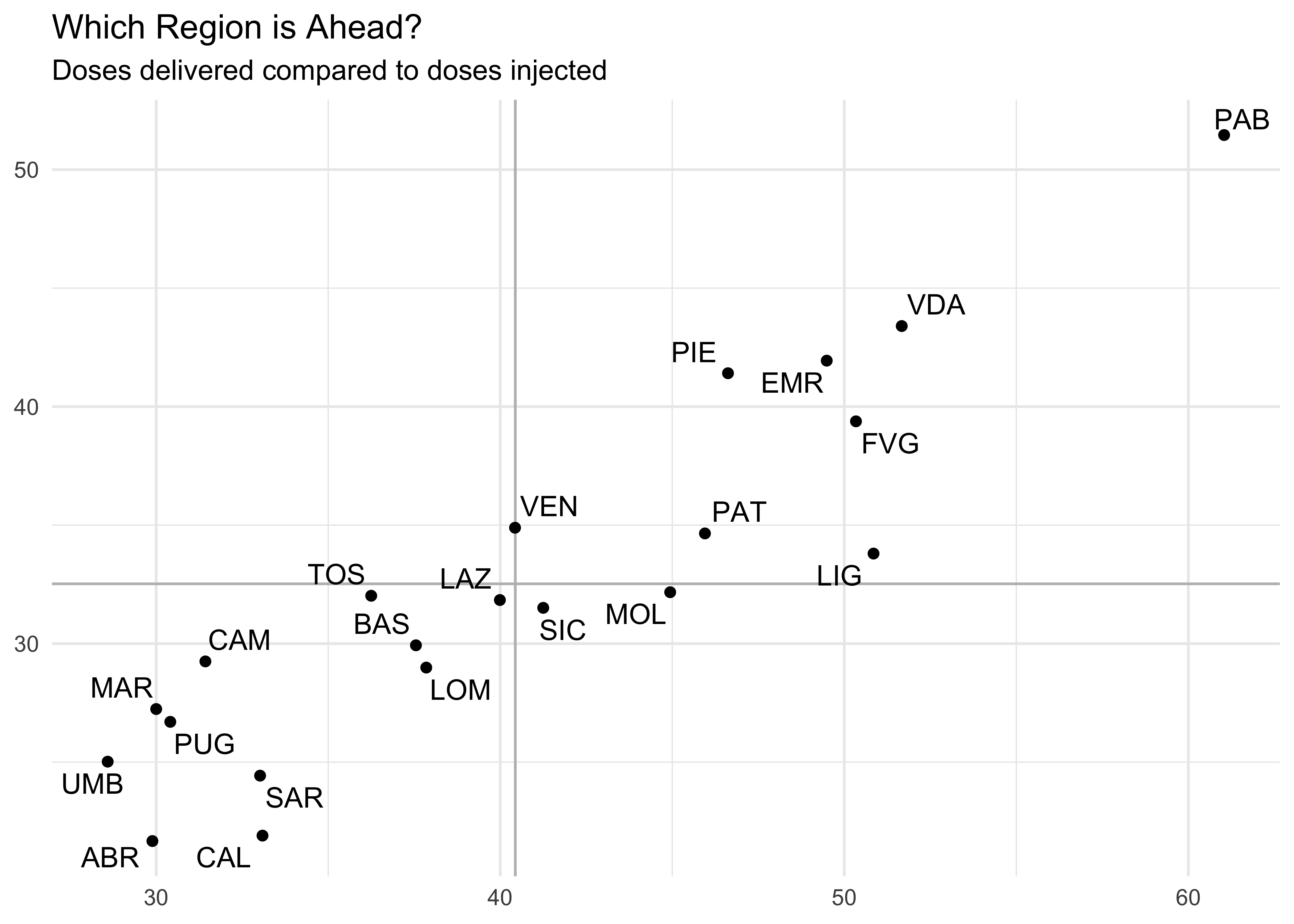
Who’s doing better?
Let’s use some other data to find the region which is performing better. Let’s load the data:
read_csv('https://raw.githubusercontent.com/orizzontipolitici/covid19-vaccine-data/main/data_ita/totals_by_area_ita.csv') %>%
  select(-NUTS2, -nome) %>%
  mutate(area = as.factor(area)) -> totals_by_area
And then make a plot:
totals_by_area %>%
  filter(area != 'ITA') %>%
  ggplot(aes(
    x = dosi_ogni_mille,
    y = vaccinati_ogni_mille
  )) +
  geom_vline(xintercept = mean(totals_by_area$dosi_ogni_mille), color = 'grey') +
  geom_hline(yintercept = mean(totals_by_area$vaccinati_ogni_mille), color = 'grey') +
  geom_point() +
  ggrepel::geom_text_repel(aes(label = area)) +
  # xlim(0,100) +
  # ylim(0,100) +
  labs(
    title = 'Which Region is Ahead?',
    subtitle = 'Doses delivered compared to doses injected',
    x = NULL,
    y = NULL
  )